CookingKeeps
Redesigning the process of cooking recipes while sharing with friends and family

Project Duration
May 2022 to July 2022
The Solution
Create an all-in-one platform that enables users to add and share recipes with others. Go-step-by-step through a recipe with small features to make the cooking process easier.
The Challenge
Keeping track of recipes can be difficult because of the different ways they are shared and the mediums (cookbooks, websites, blogpost, written, etc.). Different platforms offer different ways to read and go through a recipe.
Role & Responsibilities
UX Designer
Designing a mobile-friendly app for CookingKeeps from conception to delivery
Conduct user research, competitive analysis
Conduct interviews, paper and digital wireframing, low and high fidelity prototype
Conducting usability studies accounting for accessibility and iterating on designs
User Research Summary
Initial interviews were with five working adults between the ages 18 and 65 who have varying experiences with trying to cook from scratch or used different platforms to cook a recipe.
Reviewing similar applications and products that already exist on the market to create a Competitive Audit to understand the users’ needs and frustrations.
Participants’ Responses Summarized
Most likely use recipes from reputable sites. recipe books, or recipes shared by friends and family
Keeping track of where they are in the recipe.
Too much flavor text
Pain Points
Time: Don’t have time to cook or order out
Accessibility: Not provided additional tools or additional information
IA: Layout for recipes on websites, cookbooks, and/or handwritten recipes can be difficult to read
The User
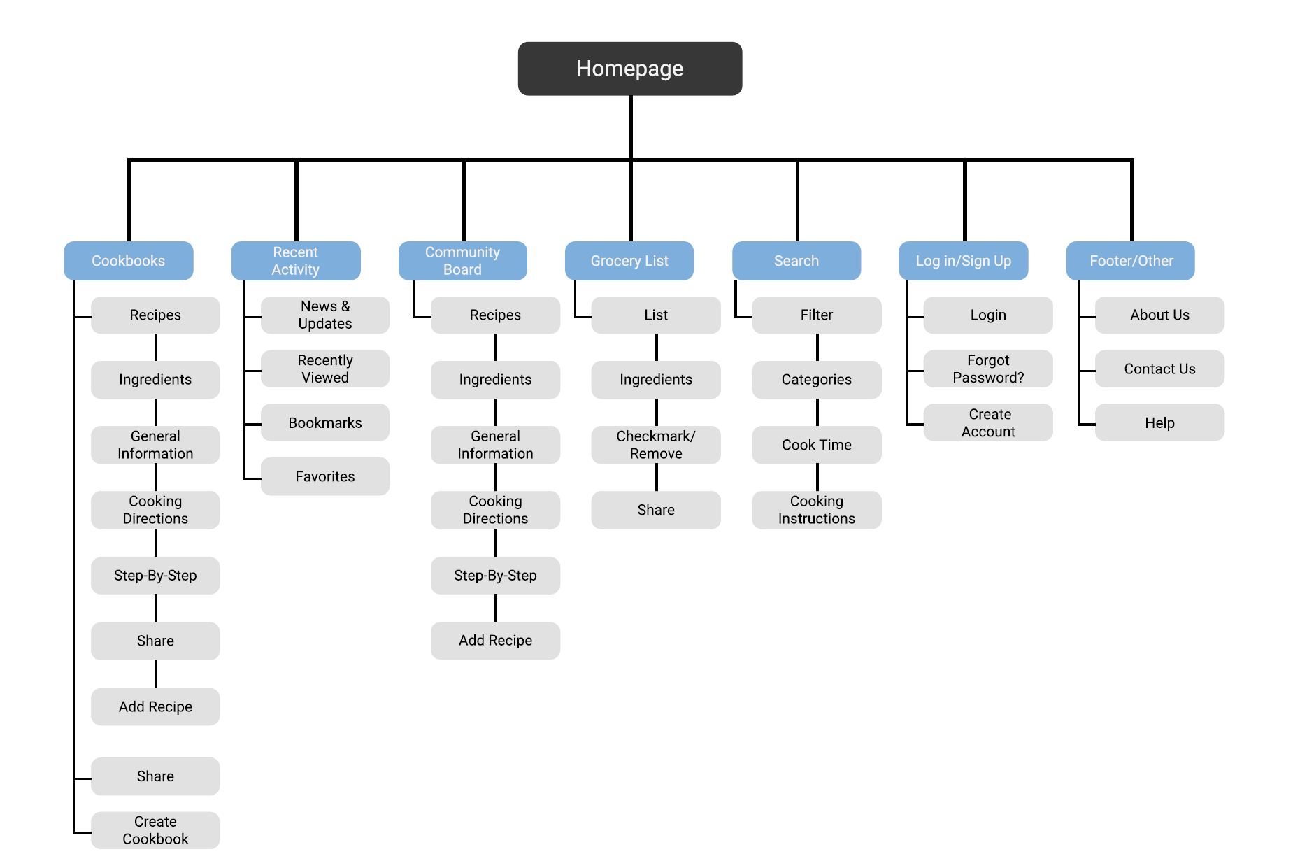
Using the user research and competitive analysis to create the persona, user problem statement, user journey map, and a sitemap to set main priorities of the application.
Problem Statement
Daniel is a diligent working adult who needs an organized way to cook meals since cooking can be overwhelming at times.


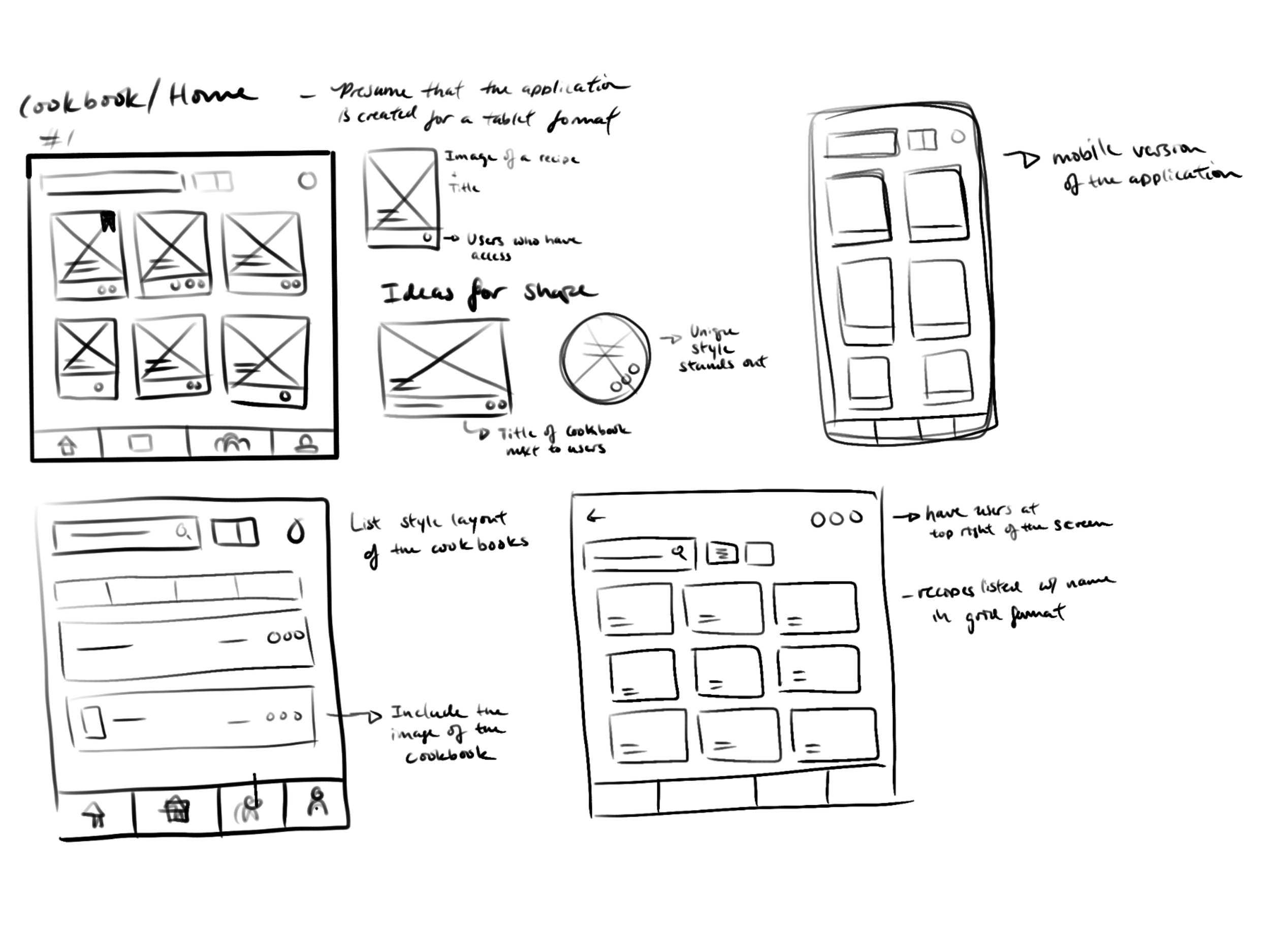
Paper Wireframes to Digital Low-Fidelity Wireframes
Taking the time to draft iterations of each screen of the app on paper before moving over to digital


Using the completed set of digital wireframes, I created a low-fidelity prototype. The primary user flow was going to a recipe then going step-by-step so the prototype could be used in a usability study. Also including pages and overlays that the user might find useful.
Interactive Prototype (if using Chrome and its not loading use the following: go to Chrome URL and type chrome://flags and search for Choose ANGLE graphics backend and select OpenGL):
CookingKeeps Low-Fidelity Prototype
Digital variations (Website vs. Tablet)
Another initial idea of creating the application was possibly transitioning into a website since the main goal was to create a tablet version of the app since most households do carry one nowadays.


Usability Study & Findings (Round 1)
Findings from the first study helped guide the designs from wireframes to mockups.
Usability Study Parameters:
Study Type: Unmoderated usability
Location: Remote
Participants: 5
Length: 15-20 minutes
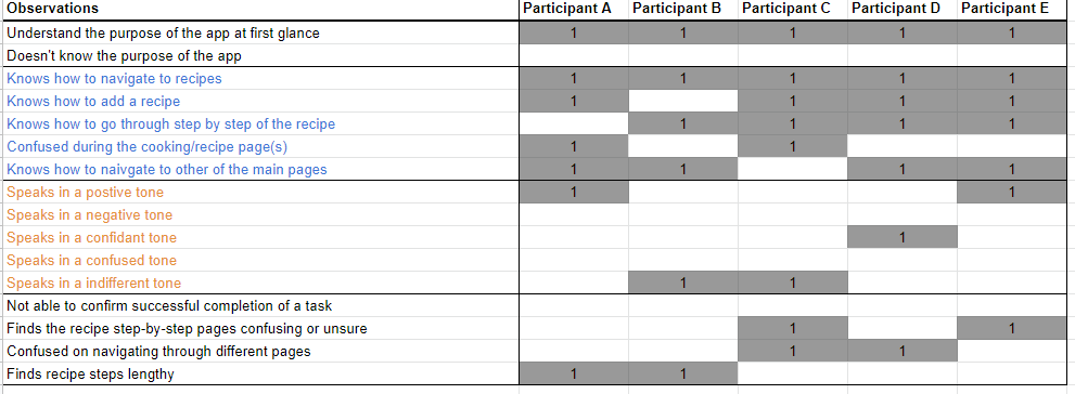
Going through the usability study the following observations were found:
5 out of 5 found the existing tools would help them cook or start cooking.
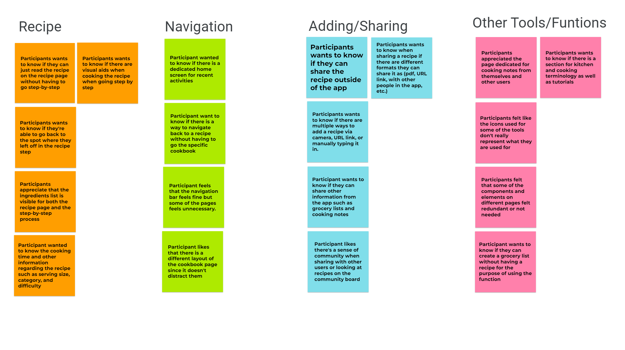
4 out of 5 said some of the iconography used for the different tools/functions are misrepresented
2 out of 5 said that they wanted some form of visual aid of the recipe they are cooking as well as a way to view kitchen and cooking terminology.
3 out of 5 did find the layout for some of the pages didn’t make sense
“I don’t cook most of the time, but I would like to have this to help me start cooking”
Refining to a High-Fidelity Prototype
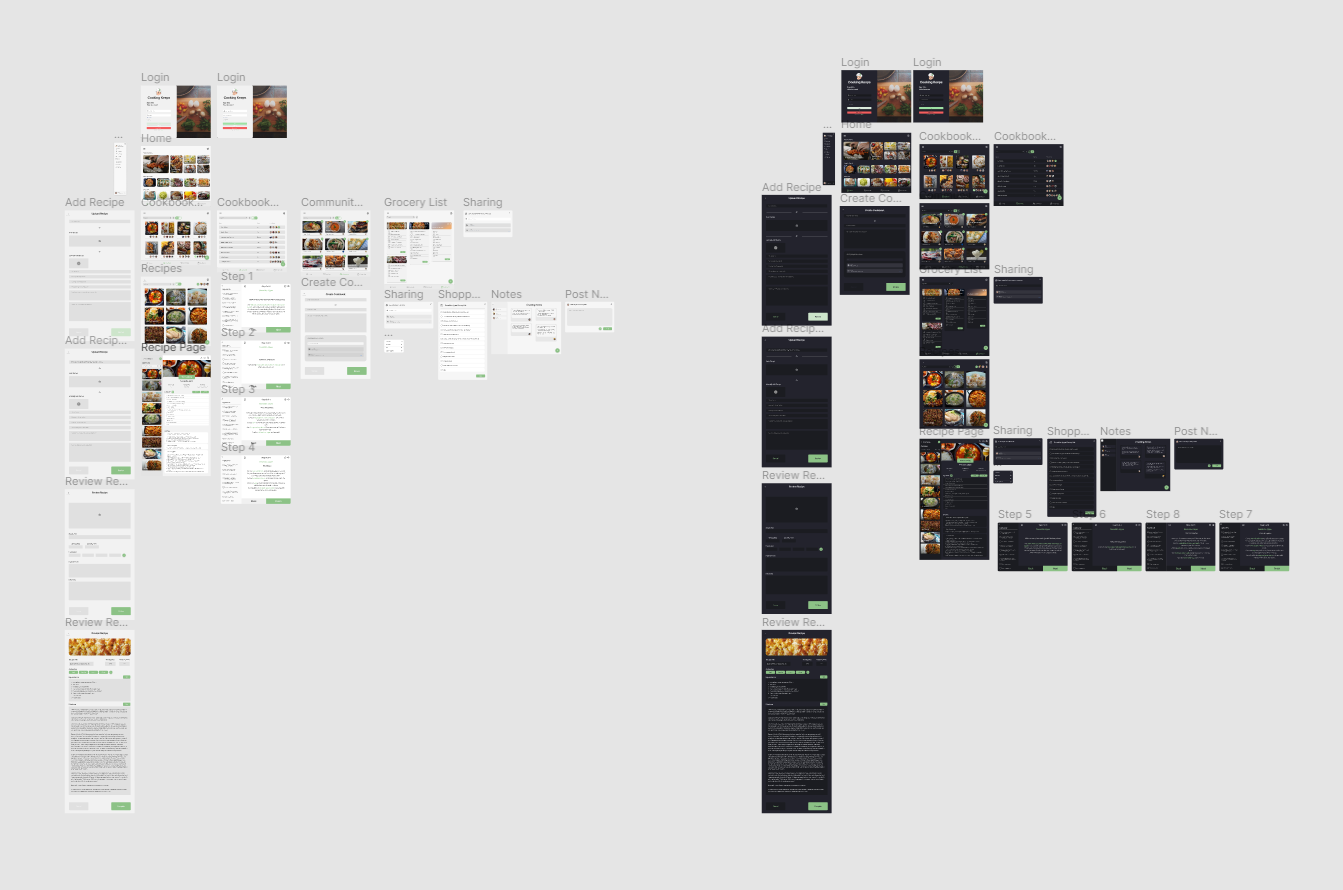
Changes from Low to High
Created a Home page where users can see News & Updates, and their most recent activities
A more in-depth step-by-step process of adding a new recipe to a cookbook
Grid vs. List version of the Cookbook page
An example of creating a grocery list from a recipe
A cooking notes page and methods of sharing recipes
Usability Study (Round 2)
Another round of usability testing was conducted using the high fidelity prototype. By testing the design at this stage, I could observe an interaction that most closely resembles a real-life interaction with the final product.
Findings:
Navigation felt off with page transitions and animations
Element sizing too small or too large
Needed a consistent color palette
Final Design and Solution
Allow different ways to add a recipe
Visually change overlay for the Cookbook page
Allow different avenues to share recipes
Maintain visual continuity from different pages to show the user which page they are on.
Providing tools and functions to help provide users a smoother cooking experience without having to use external devices.
Style Guide

Takeaways and Next Steps
Impact
The app makes users appreciate the adaptation from physical cookbooks, and other recipes to a digital experience that allows user to utilize similar tools that they would use in the cooking process as well as having the accessibility to share recipes with friends and family (including the community board).
Lessons learned
While designing the Cooking Keeps app, I learned that there needs to be realistic scope of what can be worked on within a certain timeframe but also keep in mind the main goal. During the process of usability studies and peer feedback, it allowed me to focus on what is the final product as well as improving design choices when adapting to a different layout.
Conduct more user research to determine any new areas of needs. Have a wider range of participants during user research to find overall improvements and smaller issues that can help future designs.
Review other competitor designs to see what makes them user friendly. Reviewing other forms of media and not just digital. Test for different devices for those with different accessibility.
Creating design variants for different platforms that are more readily available to users.
Fully implementing tools to help users understand functions and how to properly use them.


