Final Fantasy XIV Companion
Redesigning an app that can truly be considered a companion
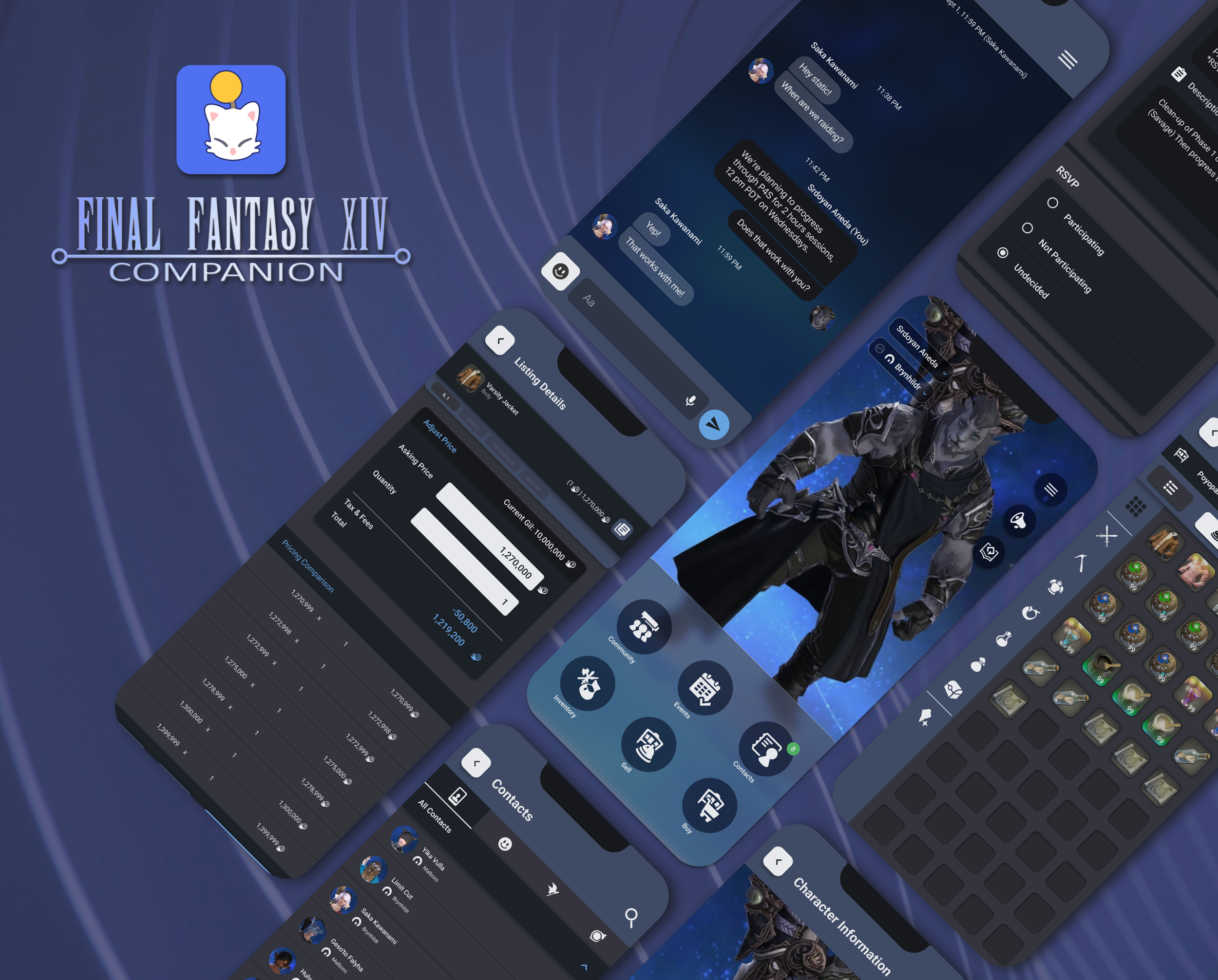
Mobile companion app to the MMORPG Final Fantasy XIV Online that allows user to view in-game information and other functions
This case study describes my process of redesigning the companion app from concept to the final design.
Project Duration:
July 2022 - August 2022
The Problem
The current functions and limitations of the Final Fantasy XIV Companion App causes players/users to not use the app to its full advantage due to its shortcomings, such as premium currencies to use limited features, and confusing navigation.
The Solution
Redesigning the companion app to include functions that users would find useful when accompanied by the game (Final Fantasy XIV Online). Keeping track of user account information, additional features to pre-existing functions, redesigning the market board and premium economy that improves user traffic.
Role & Responsibilities
UX Designer
Redesign the current FFXIV Companion app to be more user-friendly and accessible from conception to delivery
Conduct user research, competitive analysis
Conduct interviews, paper and digital wireframing, low and high fidelity prototype
Conducting usability studies accounting for accessibility and iterating on designs
User Research
Created a competitive audit to help find similarities and differences that perform similar functions to the FFXIV Companion App. Conducted user interviews with full-time students to working adults that mainly play the game Final Fantasy XIV Online.
Competitive Audit
User Interviews
Five working adults between the ages 20 and 35 who have varying experiences of using the app or play FFXIV Online.
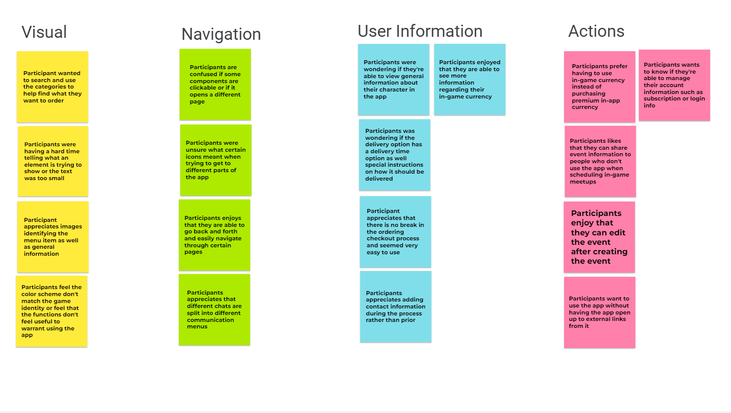
Participants’ Responses Summarized
Users use other platforms or third-party software.
Missing necessary functions.
Navigating the app feels confusing.
Users barely use the app due to the paywall/in-app premium currency.
The User
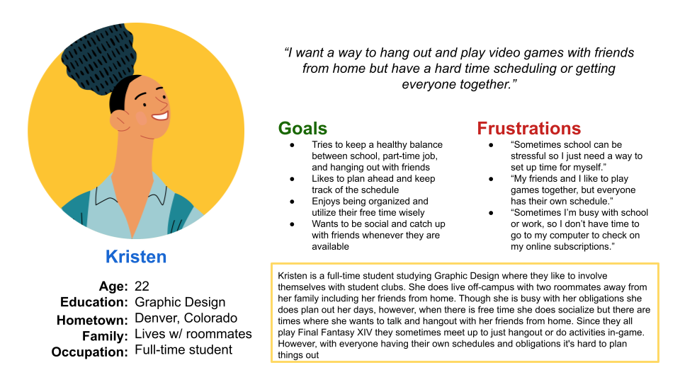
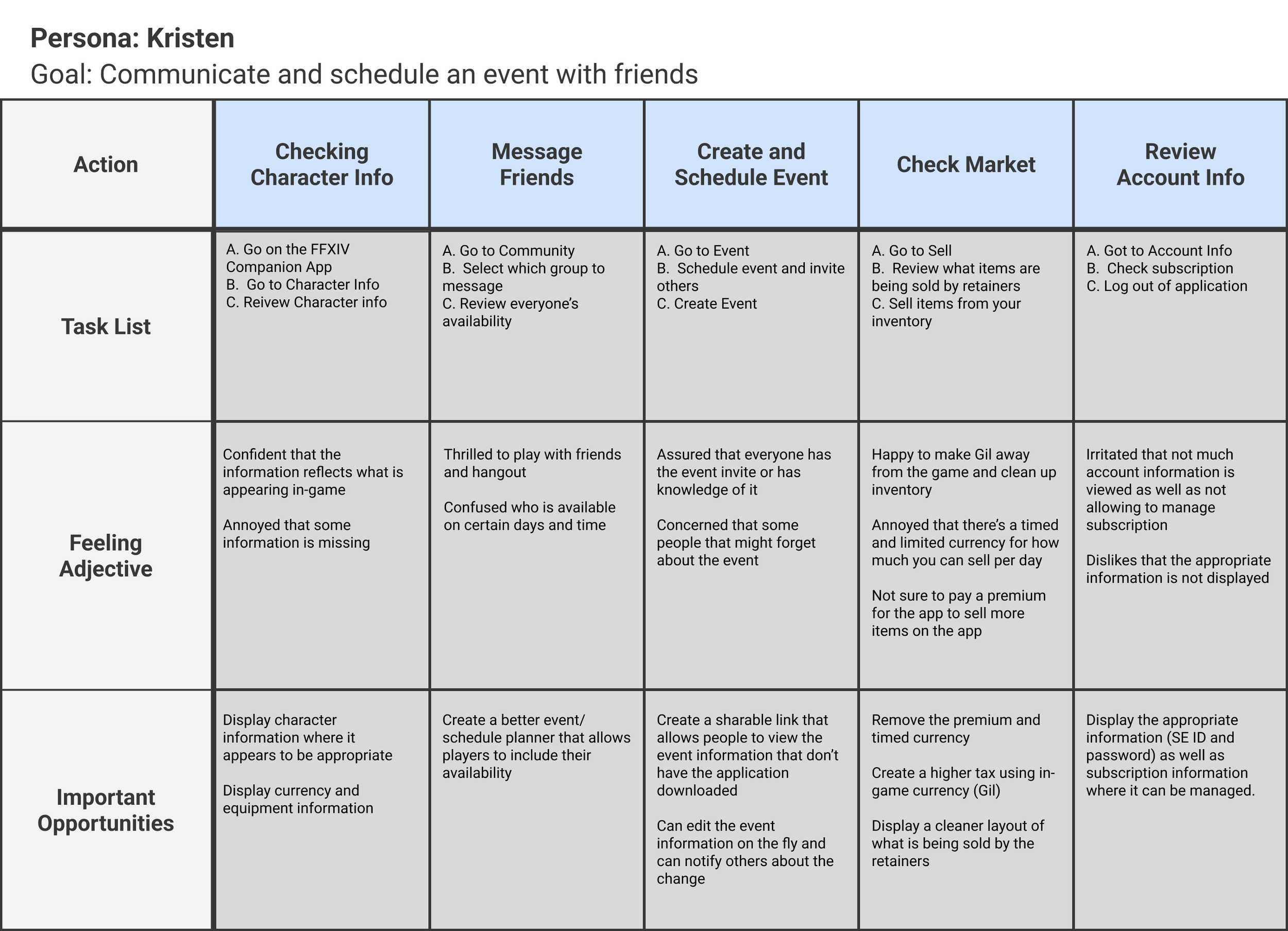
After user research and conducting a competitive analysis I went forward in the project and used the research to create the persona, user problem statement, and user journey map.
Problem Statement
Kristen is a productive student who needs a way to view their FFXIV account, and communicate with their friends to organize in-game meetups
Pain Points
Time: Not able to go to dedicated PC
Accessibility: Different platforms not consolidated into one software
IA: Hard to navigate, unfamiliar icons
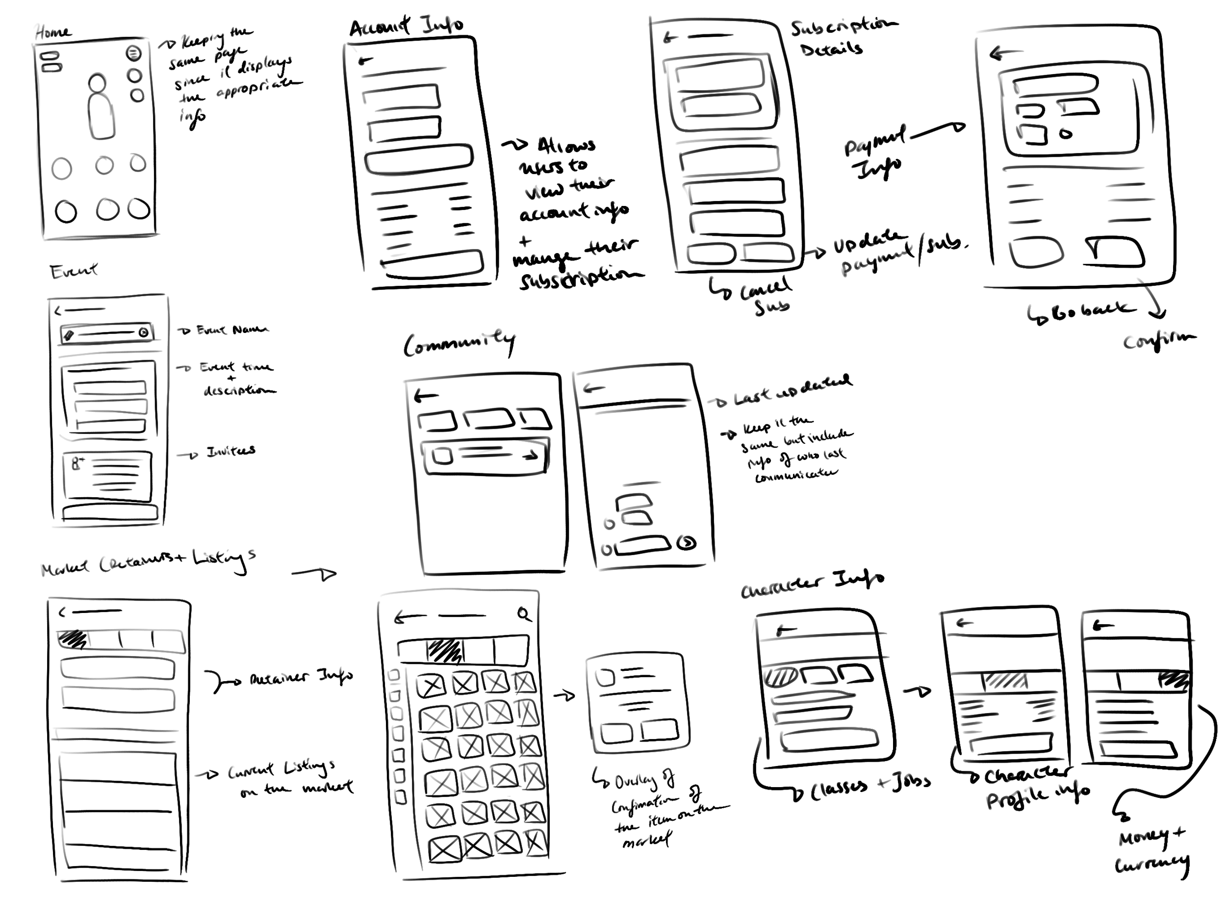
Paper Wireframes to Digital Low-Fidelity Wireframes
Taking the time to draft iterations of each screen of the app on paper ensured that the elements made it to digital wireframes would be well-suited to address user pain points.
Subscription Plan, Renewal Date, and Character Profile to help users find information regarding their account.
Removal of premium services and currency to maintain user retention.
Updating visual branding to maintain visual consistency with app navigation.
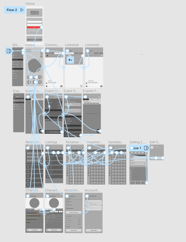
Low-Fidelity Prototype User Flow
Created a simple prototype of letting the user do the following:
Go through the Community pages and see their messages
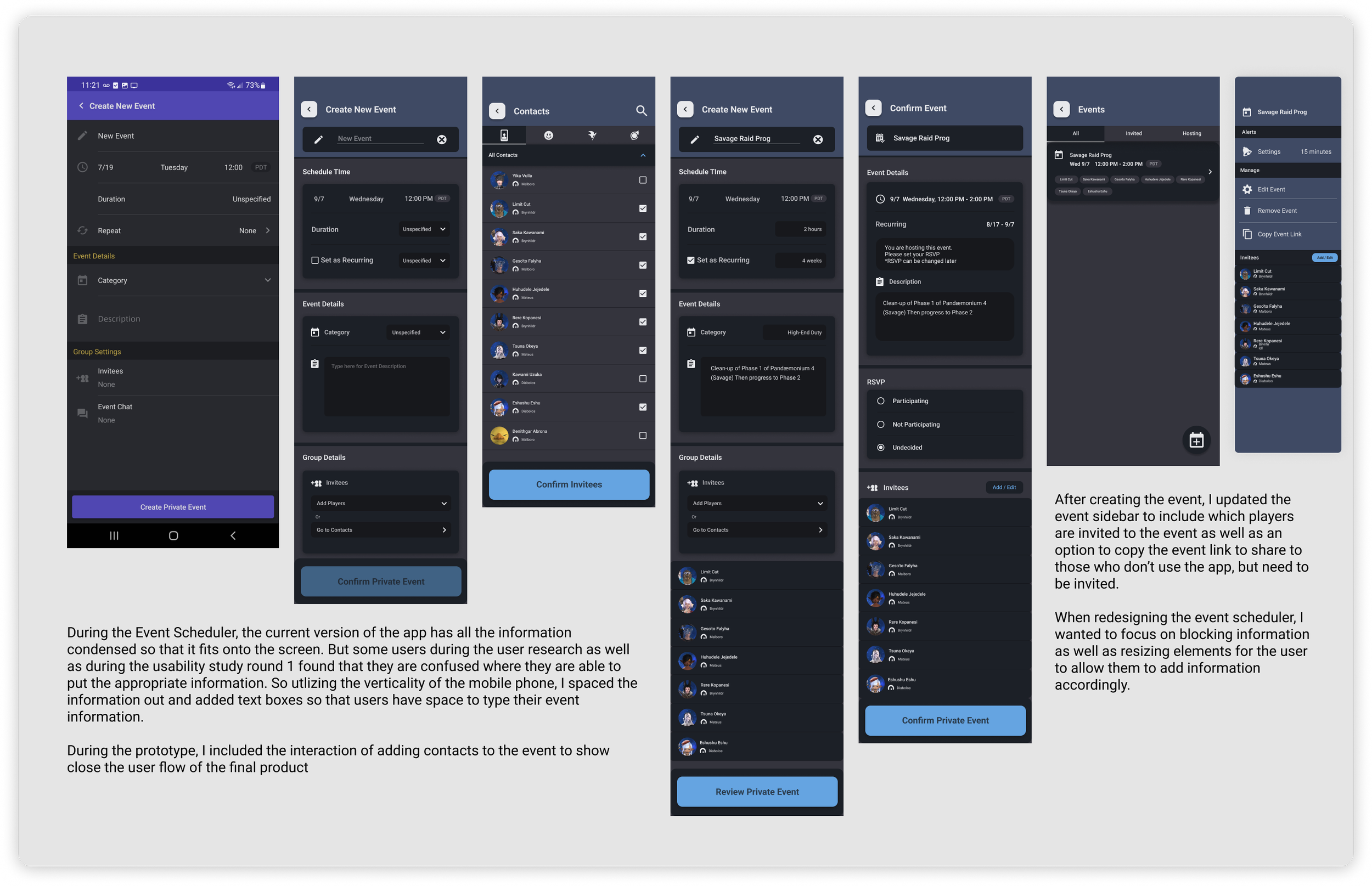
Create and schedule an event
Sell an item on the Market
View information regarding their Character and Account
Interactive Prototype:
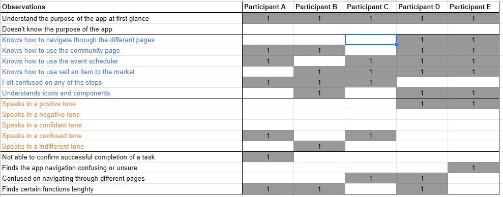
Usability Study & Findings (Round 1)
Going through the usability study the following observations were found:
Different way to resolve the need for in-app premium currency.
Creating certain pages to help manage account and character information.
Some of the icons or components need more context such as where the pages lead or an indicator.
Navigating the app felt that some of the pages were confusing.
“I usually use different apps to try and organize everything when playing the game or when I’m away”
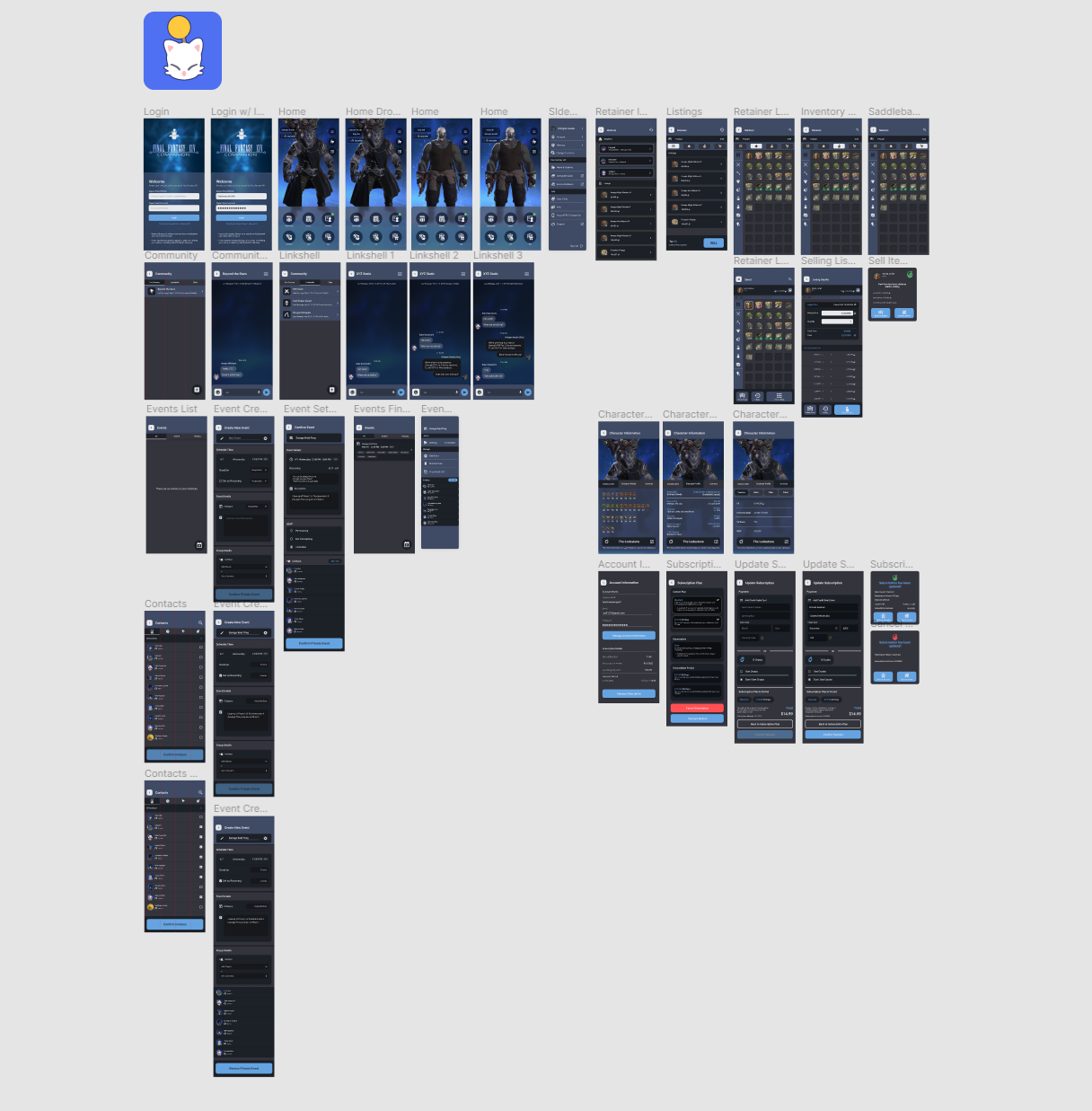
Refining to a High-Fidelity Prototype
Changes from Low to High
Including a login process
Created a Home page where the user can see their character as well as switch out their character for the same server
Included some minimum screen animation that helps users understand the flow of the app
A more in-depth step-by-step of each functions
Added additional screen to show users how the final product should fee like
Following similar visuals to the app and using a color palette more akin to the game
Usability Study (Round 2)
Findings:
Navigation felt off with page transitions and animations
Elements felt too small or blended in the background
Need to provide more context to the functions or where to guide the user
Final Design and Solution
The final high fidelity prototype for Final Fantasy XIV Redesign was finalized after the two rounds of usability studies.
Resizing elements and components so information is viewable on a smaller screen.
Removing the need for using premium currency to sell items on the market, instead in-game currency (Gil) is swapped out to compensate for the convenience fee of using the mobile app.
Instead of using their Square Enix ID, letting the user login with their email instead. Allowing the user to view and update their subscription plan with the inclusion of providing general information regarding their account and character.
Style Guide
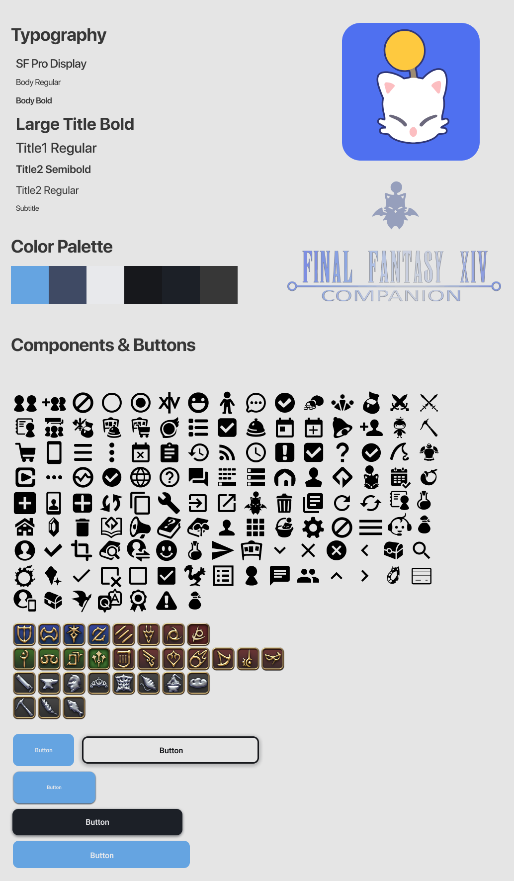
Mainly wanted to keep icons consistent with the app so I used the following GitHub repository (https://github.com/xivapi/classjob-icons) to use the icons from the app to help emulate the feel of the app in the prototype.
Takeaways and Next Steps
Impact
The app lets user access their account and information regarding their character and the online game without being hindered by paywalls or confusing navigation. With the inclusion of tools that allows the user to share information outside of the app.
Lessons learned
While redesigning the Final Fantasy XIV Companion app, I learned from users of the app that they had multiple concerns with it. While being opportunistic during the beginning phase of the project, I needed to be realistic in the project scope. To not over bloat on what should be worked on within a certain timeframe. However, during the process of usability studies and peer feedback, it allowed me to focus on what the final redesign as well as improving on the current functions of the app.
Fleshing out application features to get the prototype to closely represent the final product.
Conduct more user research to determine any new areas of needs. Have a wider range of participants during user research to find overall improvements and smaller issues that can help future designs.
Review other competitor designs to see what makes them user friendly. Reviewing other forms of media and not just digital. Test for different devices for those with different accessibility.

