Pat’s Pastries
A mobile pick-up and delivery app for the local bakery Pat’s Pastries. Allowing easy access for users to view their available freshly baked goods and pastries, and to help make sure what they order is what they get.
This case study describes my process of creating the bakery delivery app for a local bakery from concept to the final design.
Project Duration:
January 2022 - April 2022
The Problem
Local bakeries have a limit quantity of baked goods and most working adults don’t have time to walk through and order what they want. With the inclusion of those who have dietary restrictions whether it be food allergies or other health concerns most delivery food apps don’t provide enough information regarding what’s in the food.
The Solution
Design a mobile app that allows users to have their baked goods delivered or picked up as well as checking the information regarding the product.
Role & Responsibilities
UX Designer
Designing a mobile-friendly app for Pat’s Pastries from conception to delivery
Conduct user research, competitive analysis
Conduct interviews, paper and digital wireframing, low and high fidelity prototype
Conducting usability studies accounting for accessibility and iterating on designs
User Research
Conducted a report of other platforms and competitors that offer similar services With the inclusion of five semi structured user interviews and created scenarios for usability testing to find pain points.
Competitive Audit
User Interviews
Initial interviews were with five working adults between the ages 20 and 35 who have varying experiences with ordering food online or via mobile app.
Pain Points
Time: Too busy with other obligations
Accessibility: Don’t need additional or unnecessary information
IA: Text-heavy menus
“I have different food allergies so having visuals to show that what I can and can’t eat helps.”
The User
Creating the persona, user problem statement, and user journey map.
Problem Statement
Michelle is a busy working adult who needs access to freshly baked goods because they don’t have the kitchen equipment and time to bake for herself or her family.
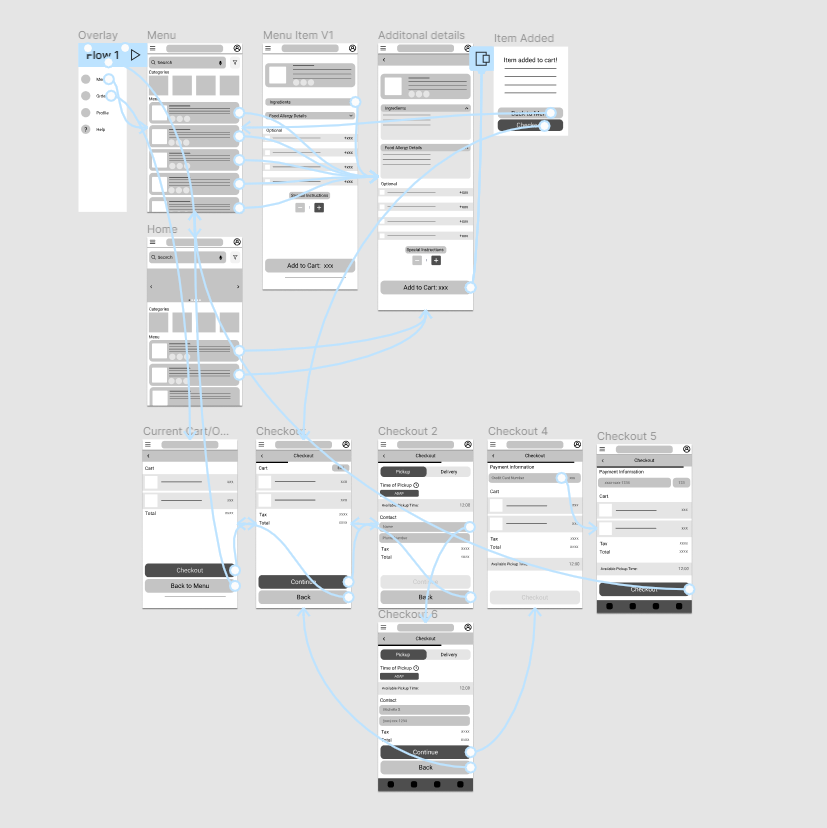
Paper Wireframes to Digital Low-Fidelity Wireframes
Prioritized immediate view of the menu and categories to help users save time
Reducing visuals to focus on information hierarchy.
Low-Fidelity Wireframes to Lo-Fi Mockup
The primary user flow I connected was adding an item to order and checkout so that the prototype could be used in a usability study.
Interactive Prototype (If you’re using the Chrome Browser and the prototype is not loading, go to the Chrome URL and type chrome://flags and search for Choose ANGLE graphics backend and select OpenGL:
Usability Study & Findings (Round 1)
More efficient way to navigate pages
Different ordering options
Save previous orders or save favorites
Refining to a High-Fidelity Prototype
Changes from Low to High
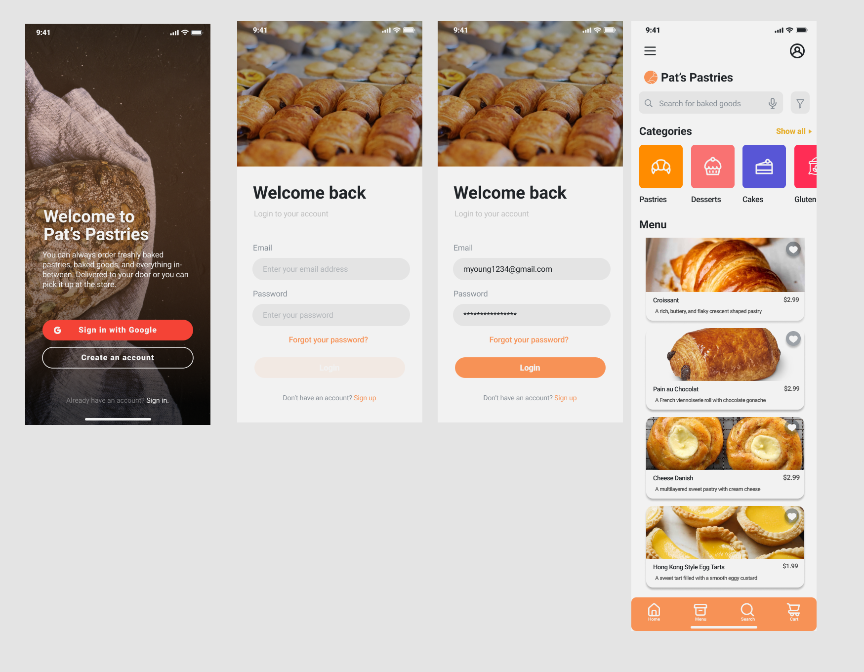
Including a login process
Created an About Us and News & Updates Page
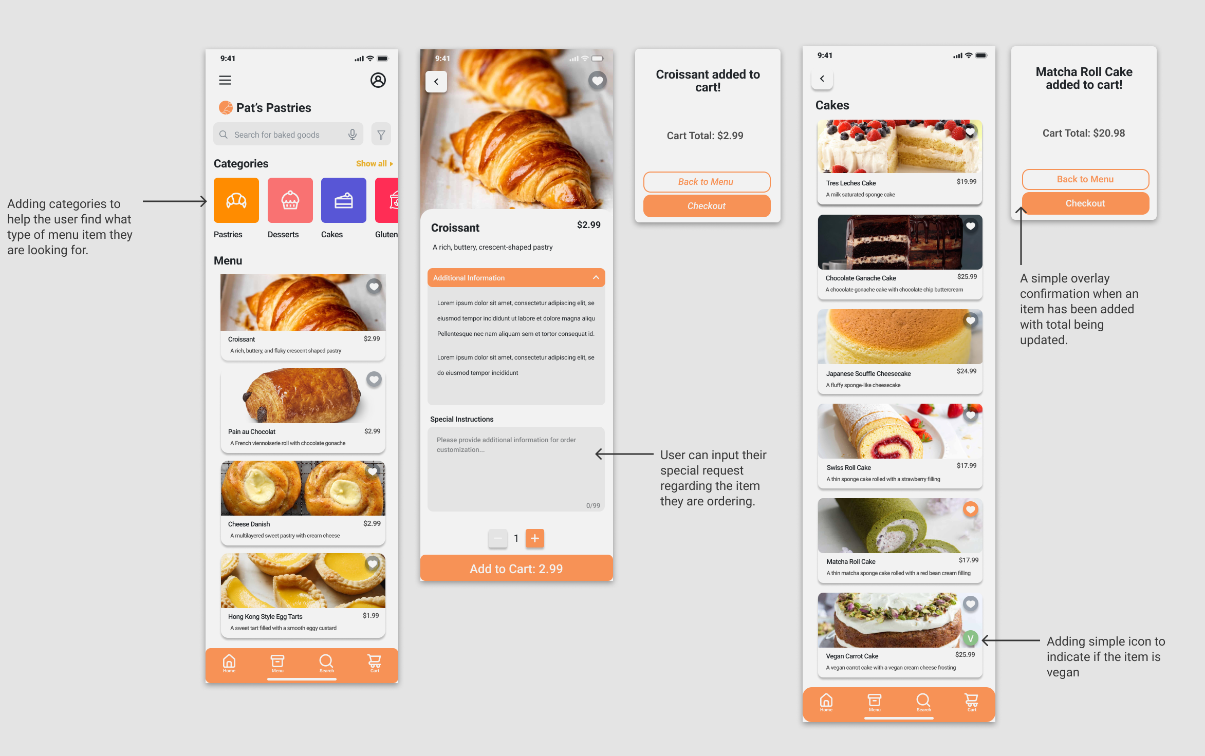
Removing Options for menu items and allowing user to type in Special Instructions
Confirmation overlay when an item has been added
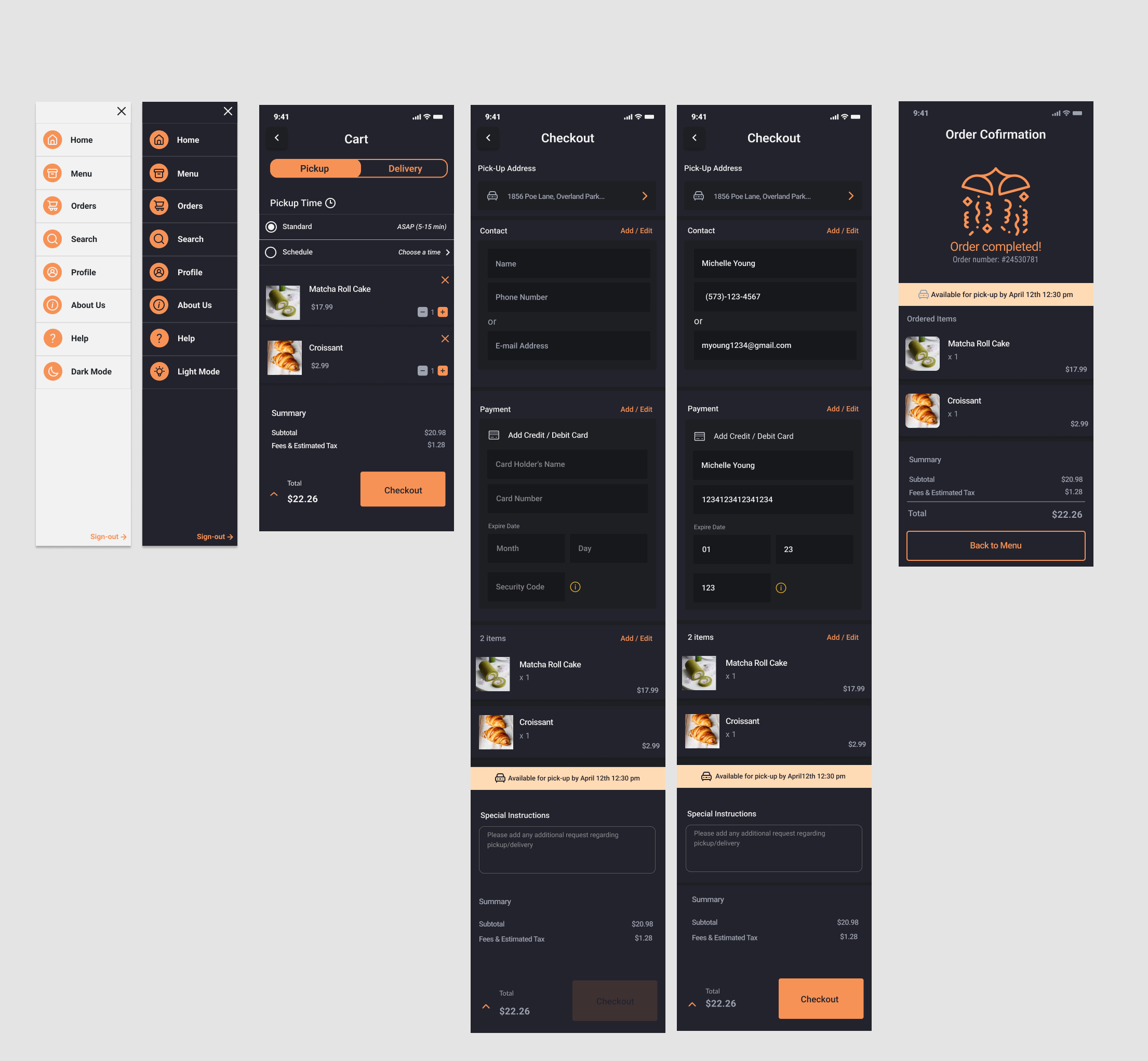
Shorten the navigation between pages for checking out as well as creating an Order Confirmation page.
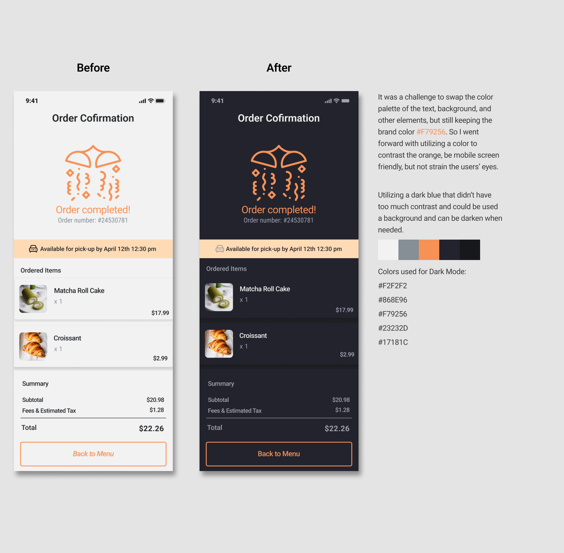
Trying to utilize mobile safe colors for the color palette
Usability Study (Round 2)
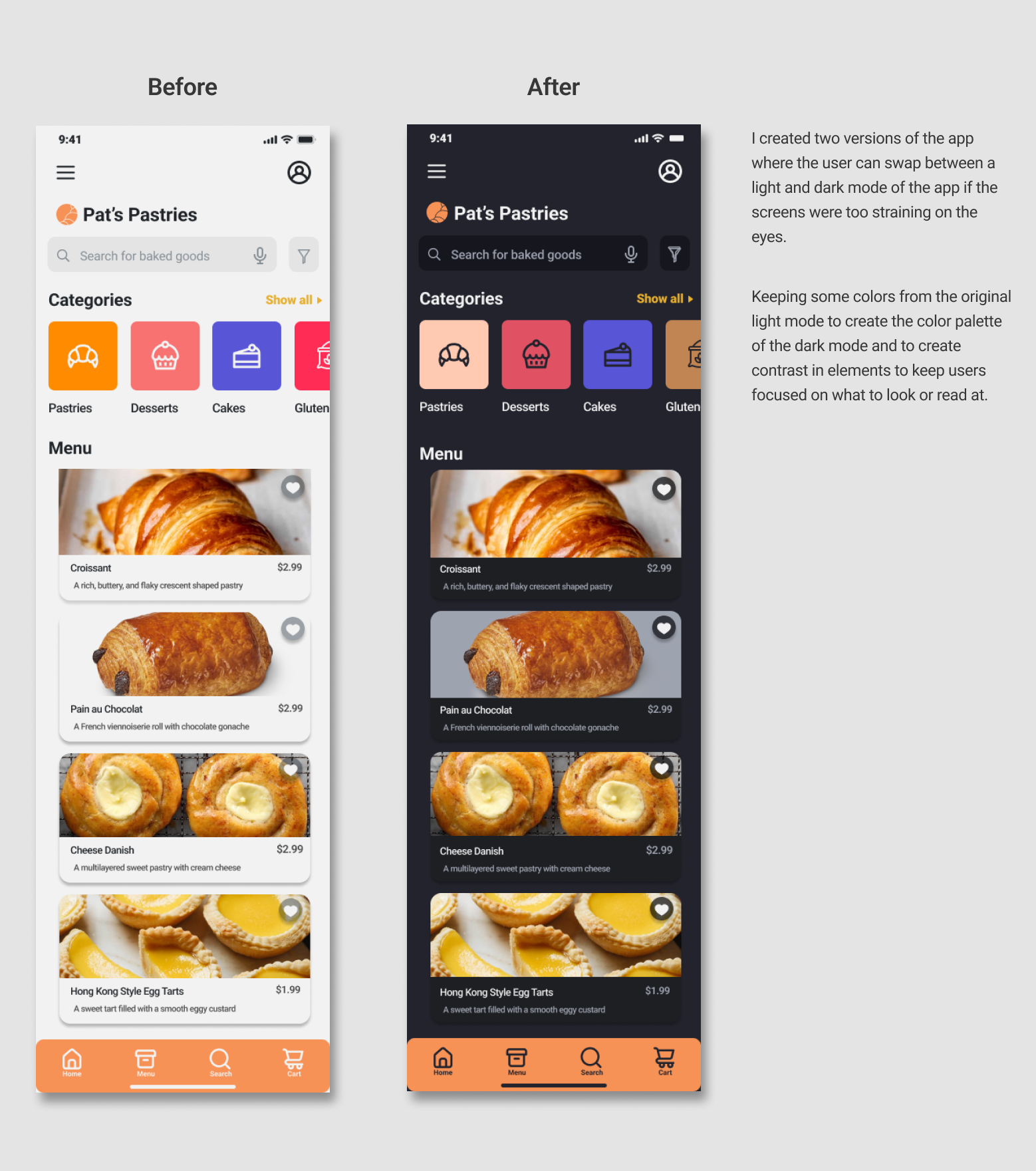
Information found in regards to the usability study: color palette was straining on the eyes, navigation wasn’t consistent, elements and text looked too cramped together.

Final Design and Solution
The final high fidelity prototype for Pat’s Pastries was finalized after two rounds of usability studies.
Interactive Prototype:
Minimize visual strain for users. Created both a light and dark mode.
Different ways to order. Including a visible component to show if the user is either using Delivery or Pickup.
Addition of providing a general description of the product
Adding simple icons to indicate if the food is safe to eat for those with dietary restrictions.
Reducing screen navigation from order to checkout. With the inclusion of overlays and visuals to indicate progression.
Style Sheet
Takeaways and Next Steps
Lessons learned
While designing the Pat’s Pastries app, I learned that the final prototype will always change from the original conceptualized ideas. During the process of usability studies and peer feedback it allowed me to improve on the design and take note on design choice that I didn’t think of including.
Conduct another round of usability studies to validate whether the pain points user experienced have been effectively addressed. Such as fully implementing the workflow for delivery services.
Conduct more user research to determine any new areas of needs. Have a wider range of participants during user research to find overall improvements and smaller issues that can help future designs.
Review other competitor designs to see what makes their application user friendly.


